Uncover Africa
Project Overview
Problem: Information about the African continent is inconsistent and biased for those who wish to know more about it. Those who are interested in the continent for research or travel purposes do not have a consistent and reliable source of information to be able to consult.
Goal: To inform our target demographic who may be interested in African history, culture, and potentially even some places to visit.
Purpose: To provide users with an online resource bank on different aspects of the African continent such as tourism, history, culture and so on.
Deliverables: Mockups, prototypes, wireframes
Roles and Responsibilities
Lead UX Researcher & UI Designer
Initial User Research Summary
Information was gathered on people who:
- Are intrigued by Africa as a continent, or perhaps certain African countries, but want to know more about others.
- People who like travelling and exploring new areas.
This phase of the research was completed by undergoing secondary research, using the resources of social media, articles, videos, and online statistics and survey data to carve out a rough idea of who our potential users are, in the form of “provisional personas” and validate our assumptions.
Information about the continent is not at all obscure in this day and age, thanks in a large part to global technology and social media becoming used by more and more Africans every day. Many users voice their opinions regularly, and many people upload videos on platforms like YouTube and TikTok talking about their experiences of the continent at large.
Key Findings 1 – Travelling
- 61% of people who enjoy travelling, would always opt for arriving at their destination via plane.
- The majority of adults above the age of 30 would not like to fly for more than 8 hours. Adults up to 29 would not like to fly for more than 11, whilst some travel enthusiasts, regardless of age, have no problems with flight duration.
- 41% of adults do not wish to travel during the pandemic.
- Solo travelling is becoming increasingly more popular, with the biggest rise in gen Z, with now approximately a third saying they plan on solo travelling; however many feel limited by their funds.
Key Findings 2 – Perceptions about Africa
People believe that:
- Africa is a single country with a single unifying culture and continental wide customs.
- They would not be able to enjoy themselves in Africa due to a perceived problem with internet availability and quality, and access to power.
- Cities in Africa are sparse, and many of the population lives in quiet villages with not much to do.
- They are unsure of the languages of many African countries, as well their names or locations.
- They are connected to Africa via means of food, music and entertainment.
In summary, it seems that the problem exists mainly with the narrative of “one Africa”, which is a recurring idea that all of Africa is, if not homogenous, is extremely similar, disallowing the diversity of the people and the culture to be seen and recognised. Africa is also seen as “dull” or “limited” in terms of enjoyment or activity.
In terms of travelling, we can see that there is now a sudden shift in those wishing to solo travel, especially in the younger generation, but many feel hindered by their finances. The plane is the preferred mode of transport, and long flight times aren’t popular.
Who is our user?
To answer this million-dollar question, I used our Initial User Research Summary to screen candidates so that I only attain worthy responses that will aid in the research and then conduct User Interviews. The purpose of the interviews were to validate assumptions and understand our users’ desires and frustrations. Although the plan was to conduct interviews in person, due to the restrictions in place because of COVID-19, I opted for a google forms survey which was sent around to willing participants who met my criteria for an interview. I asked 10 questions and gave a lot of room for the candidates to be as open and free as possible with their answers. Their age was also collected for research purposes, in order to get some information about our demographic. Some candidates expressed that they had already previously visited Africa and were able to offer some insight about their experience or wanted to return to a different country but were unsure of which one.
I then analysed the data and arranged them into affinity diagrams, made some important takeaways from the data, and then crafted a user persona to represent who our user is. This will help me to tackle the important issues and keep in mind some of the user’s struggles while iterating on solutions.
The interview answers and the affinity diagram as follow, below:
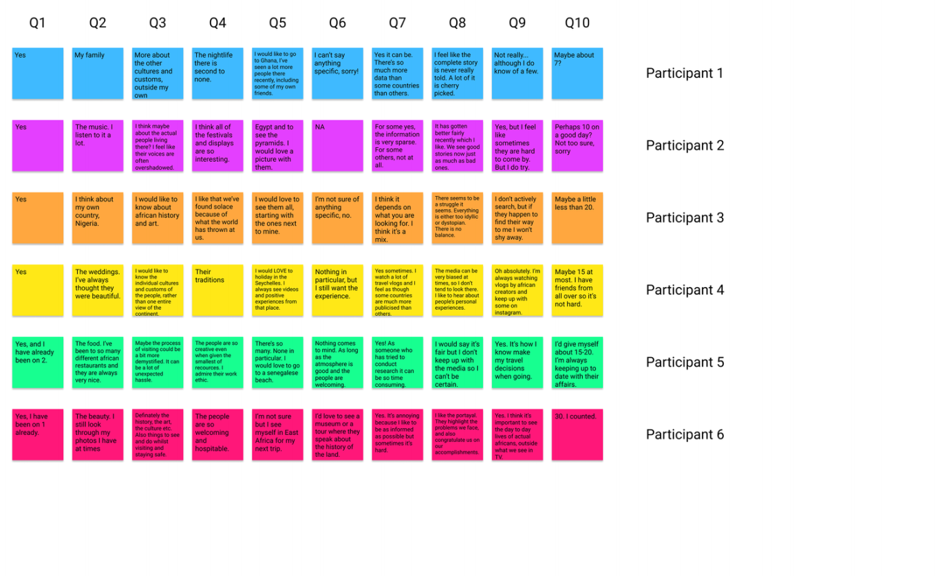
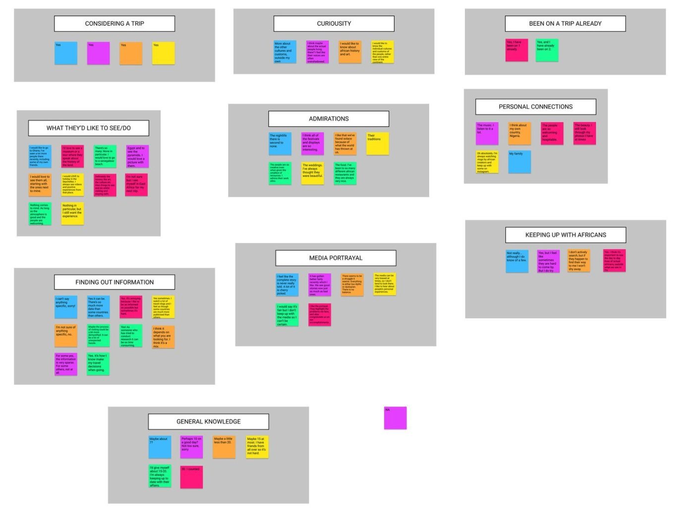
From this, I made the following “takeaways” from the data:
- People are interested in the art, culture and history of African countries.
- People are not too concerned with any landmarks or attractions Africa has to offer, but are more focused on having a good experience with a warm atmosphere.
- People have trouble finding out specific information about African countries due to the unequal distribution and coverage of countries.
- There isn’t a lot of readily available information on how to visit Africa, which can leave people frustrated and confused.
- People think Africa has a lot to offer in terms of nightlife, festivals, food and displays.
- People have a problem with how the media represents Africa, and don’t take it as a valuable source of information.
- People feel connected to Africa via social media, personal experiences, or music.
- People don’t feel that keeping up with African content creators or personalities is that important, when compared to ones in other countries.
The next step was to construct the user persona, as is seen below:
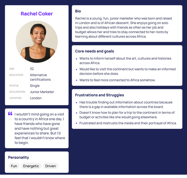
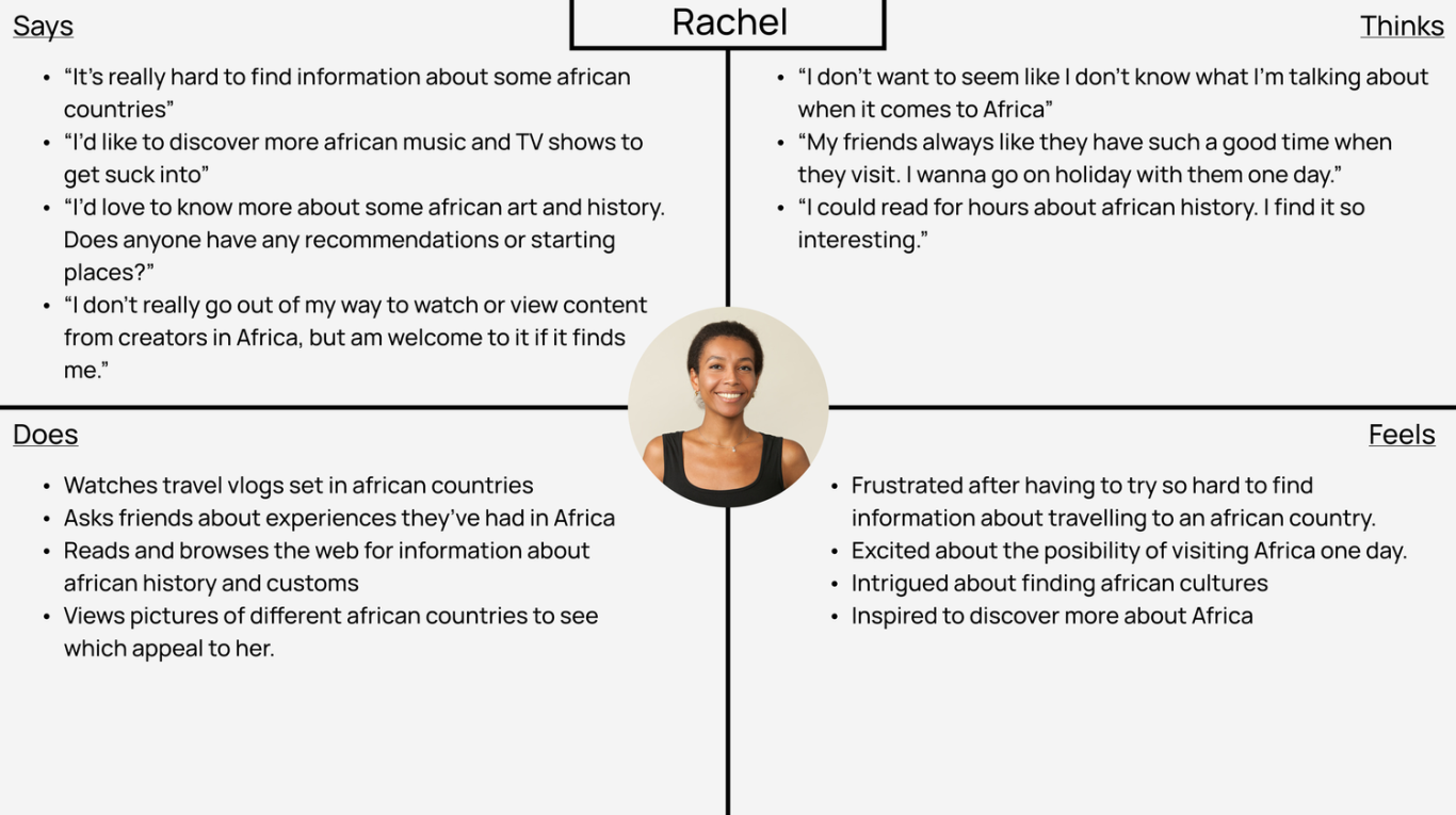
I believe that Rachel is as close to our user as we can get. She fits the demographic based on both the secondary and primary research collected, and outlines all of the pain points experienced by our candidates. Now that I’ve brought my persona to life, I needed to step inside their heads to see what else was I could discover about the user before trying to build solutions for them.
For this, I created an empathy map.
Building the Brand
After conducting user research to understand their goals and challenges, I strategically curated Uncover Africa's content to be both inspiring and descriptive. This approach engages users, sparks their imagination, reveals possibilities, and fosters trust. The goal is for users to leave the site feeling enriched, curious, and excited.
To maintain a delicate balance, the content makes use of a friendly and insightful tone, somewhat similar to a knowledgeable friend rather than a stern authority. This aligns with Uncover Africa's values of integrity, fairness, and accuracy, positioning the brand as an educational resource presenting the diverse facets of the continent.
Recognizing the potential information overload, the site's organisation became of crucial importance to me. After numerous iterations and ideation sessions, I was able to represent the final structural solution in the form of a sitemap to show the overarching layout, ensuring a clear and logical site navigation. I felt as though this approach reflected Uncover Africa's commitment to delivering quality content while making it easily accessible and digestible for its audience.
Note that orange boxes denote links to other pages.
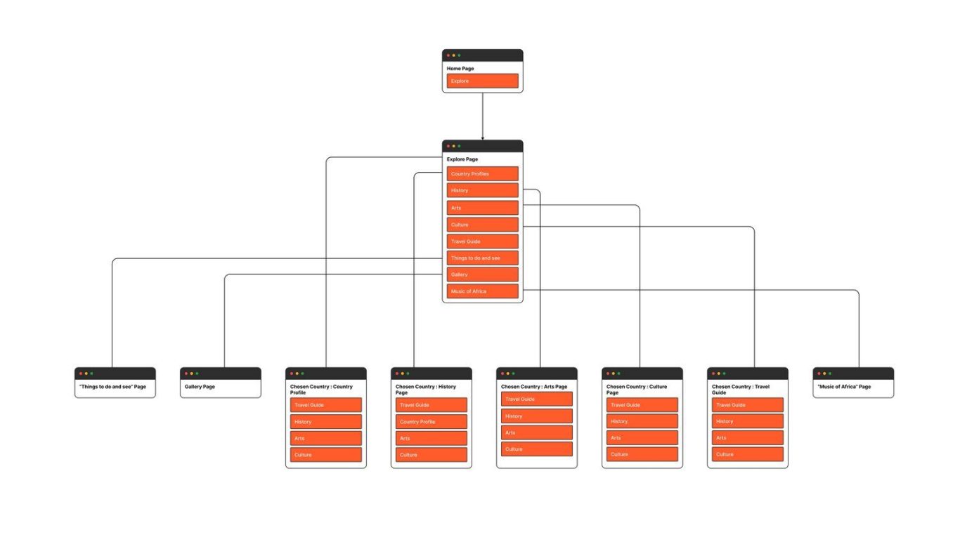
This was my preferred way of laying out the content for the site. It revolves around a set of interlinks, allowing the user to jump from page to page when viewing information about a country. I decided not to draw those lines for the purpose of simplification. The main home page will contain a call of action which will prompt the user to the explore page, which is where everything on the site will live. From this page, the user can click through any of the links to find out their information.
I’ve used “Chosen country” here on the labels to reflect the fact that when the user clicks the page from the explore menu, they are presented with a list of countries that they will then click through to get to their “chosen country” and be shown information pertaining to that. Some pages don’t have this list, because the information is generalised. For example the gallery, or the “things to do and see” page which will feature some tourist attractions or activities around the continent. To alleviate confusion, I plan to include a way for the user to get back to the main site menu at any time, as well as some breadcrumb links so the user can navigate up levels, or need to be aware of where they are on the site at all times.
A user flow allows for a demonstration of what path we would like our ideal user to take in an ideal situation. The aim is for the user to be able to do this in as few clicks as possible and should be the easiest possible path. To do this, I envisioned Rachel (our persona) attempting to find information about the history of Sierra Leone. Here is how imagined it would be completed:
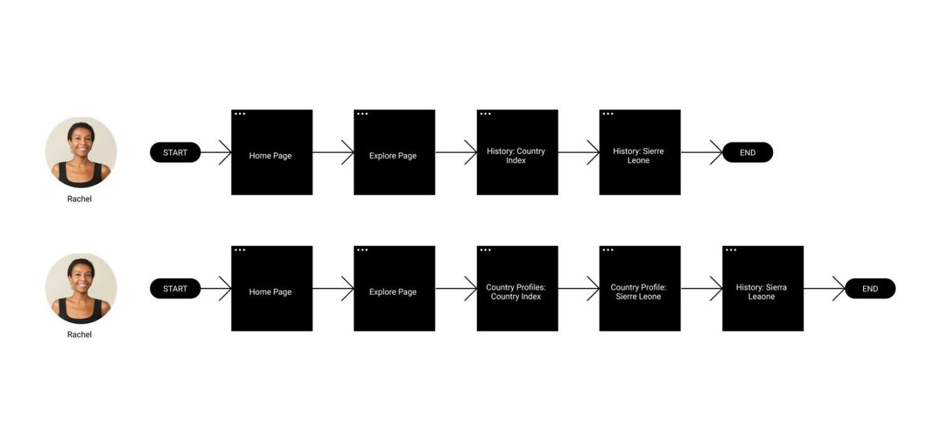
As seen, I actually created two flows. Both have the same final destination, but I considered that Rachel might choose to visit the country profiles first in order to get a brief summary of Sierra Leone, and then would choose to then browse the history. This is because at this point Rachel came into the site knowing what she wanted to find out about, which was information about Sierra Leone. So I estimated that she might be compelled to go to the country profiles, then find the country she wants to know about, and then visit the history. I predict that this will actually be a trend among many users. Because of this, I know that I should apply complete clarity when listing the menu on the explore page, such as indicating what links are sorted by country and which are not. Rachel also has the choice of browsing the home page when she lands on it, but I decided not to include that in my user flow since the aim here is in “as few clicks as possible”.
Initial concepts and ideas
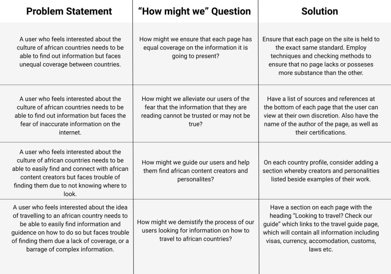
At this point, enough data, research and planning had been done to begin implementing a solution. For this stage, I decided to implement Problem statements based on persona data, alongside solvable “How might we” questions to brainstorm and answer before moving on.
Here are the questions and solutions:
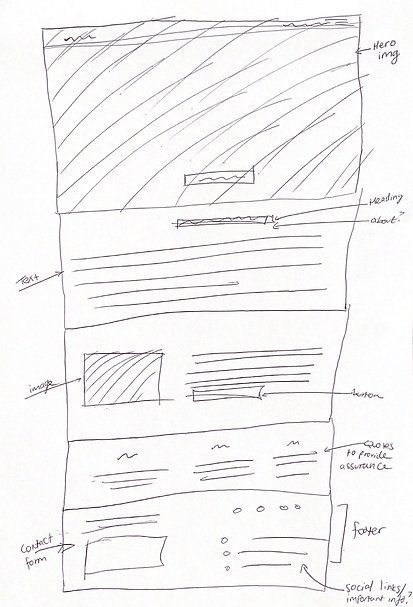
It was now time for some low fidelity sketches. During the process I’ve had a few ideas on how the final product might look like. It was time to turn these ideas that lived inside my head into something that could be visualised. Before making wireframes in a design program, I like to sometimes to do quick, imperfect sketches on pen and paper just to see what my ideas look like visually. Doing this means that I always have a solid base to work from when iterating in an actual design program. Also, it allows for any ideas which I have that I thought we’re good ideas, but turned out to not be the best fit, to be easily discarded.
Here is a quick sketch of the home page on pen and paper:
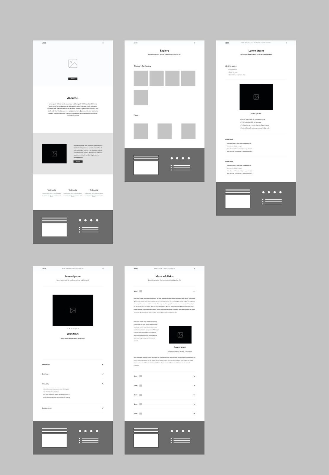
After having iterated on some low fidelity sketches, it was time to make a more polished, high fidelity wireframe. The program I used to achieve this was Figma, and I used my sketches as a base. However, some components did move around in the final versions after some more iterations, as using Figma allows you to preview sites as if they were live, I found that some components didn’t quite fit in the order that I drew them out, on paper.
Here are the wireframes:
Usability testing
For my Usability Testing to take place, I had to turn the wireframes into a medium-fidelity prototype to allow interaction for the testers. Luckily, this is rather easy to do in Figma.
My Usability test was an in-person, moderated test with a sample size of 6 testers. The only thing required was a laptop and a suitable space, since Figma allows you to share prototypes via hyperlinks. The Problem Statement that makes it clear what insights we want to gain was:
"We want to assess the usability of our site for our target users to be able to navigate across the site easily and find the information that they need in a timely manner, not being confused or thrown off by the layout or content organisation."
I had a time frame of 15 minutes, with a target of 10 minutes, and it involved some think-aloud tasks, as well as a post-test rated questionnaire. The usability test would then be evaluated on the criteria of Task Completion Rate, the answers to the Questionnaire and Time-on-Task. I also made a note of whether or not I had to prompt the users after giving initial instructions.
This data was all analysed and broken down and recorded into a usability test report, which was a comprehensive document detailing the goals, methodology, and the findings, which can be accessed here.
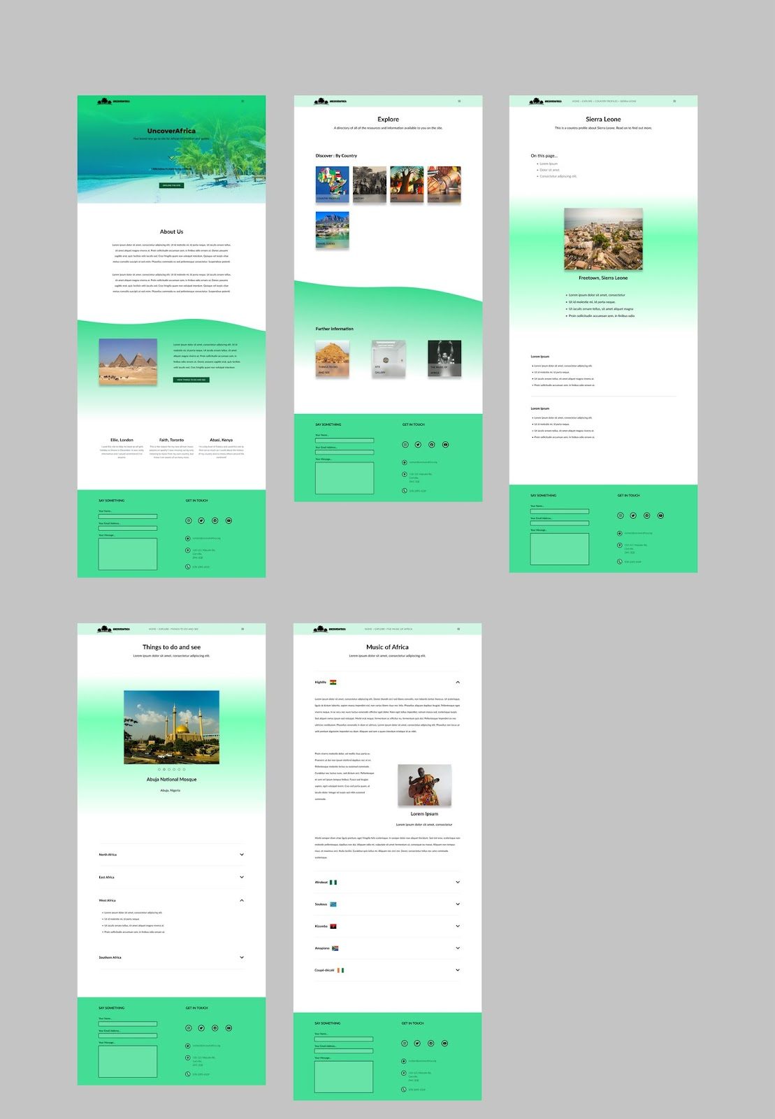
Final Designs after Usability Testing
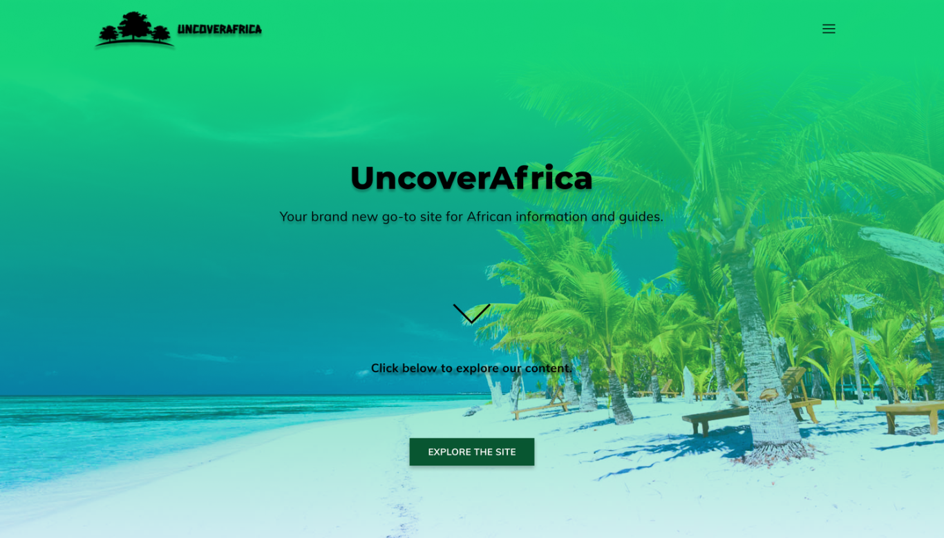
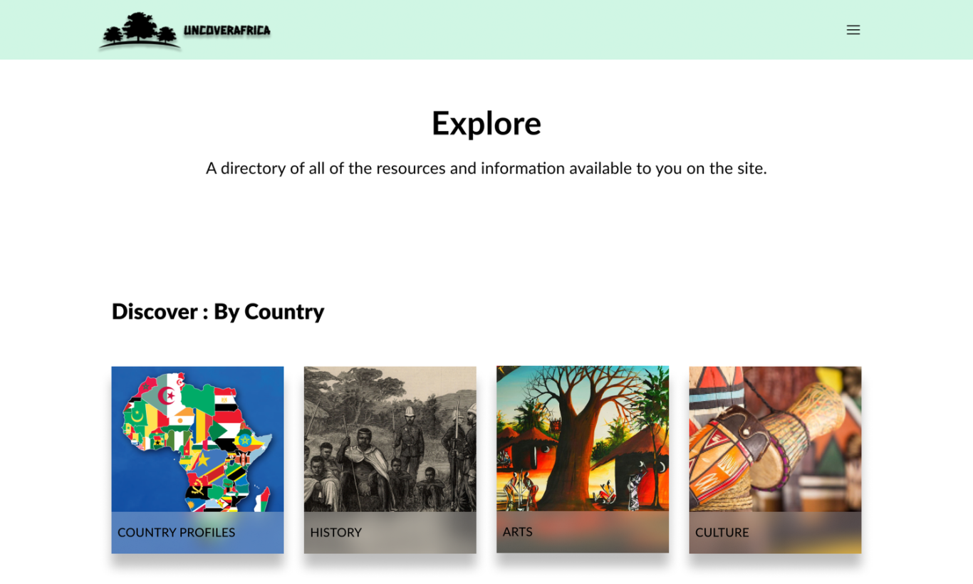
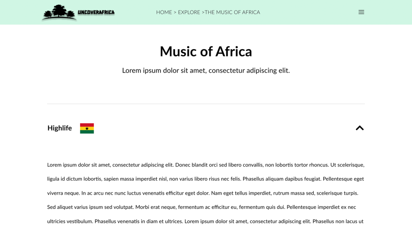
Now that I had some user validated, high fidelity wireframes, it was time to turn them into polished mock-ups. I started right away developing a colour scheme and finding a hero image. I then found suitable images for all of the cards and injected some colour throughout the pages in different ways. I used wavy lines and gradients for smooth transitions for colour in order to make to make the site feel more organic and not fixed. I also polished the footer and gave it a more realistic and nicer look. I used a mixture of lorem ipsum text and actual copy to achieve a mock up that would feel like a real site. All representations and stand-ins were swapped for actual quality images.
Product Success
After the final high-fidelity mockups were produced, I prototyped them to allow for interactivity for our end users. The feedback received was widely positive, with the overwhelming majority saying they would use the product if it were developed into a real online site. The assumptions and research previously undertaken was deemed to be valid, and it is clear that the product would add value to the lives our target demographic. An accompanying online rated questionnaire was sent alongside the prototype link, and the results are available to view here.
©DESIGNS BY ANU. ALL RIGHTS RESERVED
We need your consent to load the translations
We use a third-party service to translate the website content that may collect data about your activity. Please review the details and accept the service to view the translations.