The Likkur App
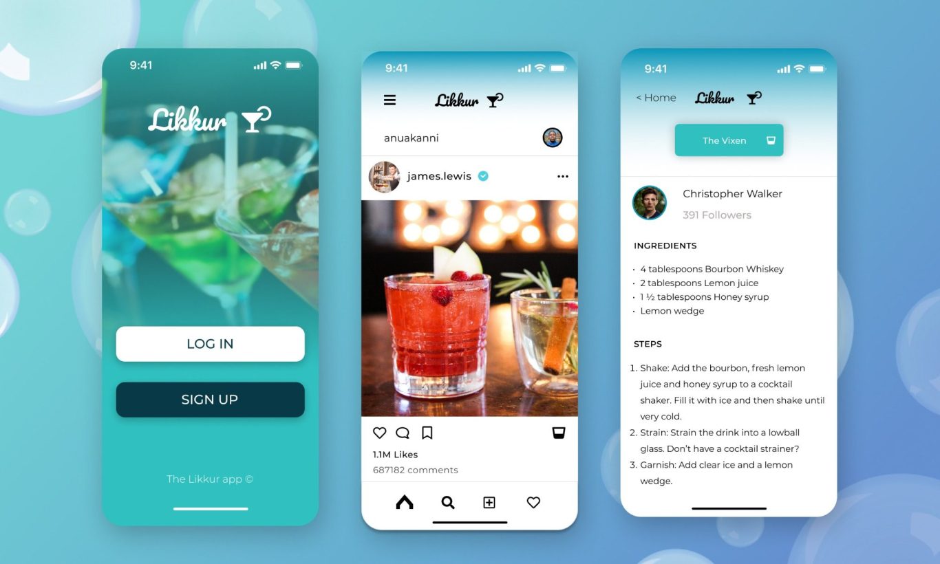
Project Overview
Problem: Social drinkers are dissatisfied with the lack of variety of cocktails and other alcoholic beverages to enjoy in social settings and events.
Goal: To design, prototype and create a branding experience for a mobile social media app that will benefit our target user.
Purpose: To give users a universal way of sharing, creating, and trying different and exciting cocktails and drinks, with the option to curate their experience with drinks that are more suited to their personal tastes and preferences.
Deliverables: A working onboarding prototype with some brand image ideas.
Roles and Responsibilities
Lead UX Researcher & Lead UI Designer
Initial user research summaries
London is known for many things, one being its vibrant social scene and its buzzing nightlife. It should then come as no surprise that it is home to a multitude of bars, clubs, and other prestigious venues that often host events where people from all corners of the island, and the world come to unwind, socialise, and well, drink.
The target demographic for this mobile app are those who are not just social drinkers, but passionate night owls who are constantly on the hunt for "instagrammable", aesthetically-pleasing, and above all, delectable alcoholic beverages. There has even been a rise in trends of those who are learning to make their own drinks as a hobby and for amusement; with cocktail-making classes and YouTube videos being searched for more than ever before, and it being the subject of many games nights and social activities.
A noticeable trend from the target demographic is a rise in complaints of the lack of variety of these drinks; many venues offer the same uninspiring 5 drinks at astonishing unreasonably upscaled prices, and note that many venues possess a lack of originality. Based on analytics data collected, the target user sits within the 18-39 range, mostly from major UK cities (London, Manchester, Glasgow). They are outgoing, mid-high income earners across skilled industries, and active on social media. A good portion (estimated. 30%) are employed in on-traditional sectors (entrepreneurship, social media content creation, finance/tech founders) an so on.
User Personas & Journey Maps
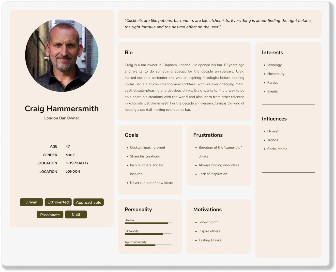
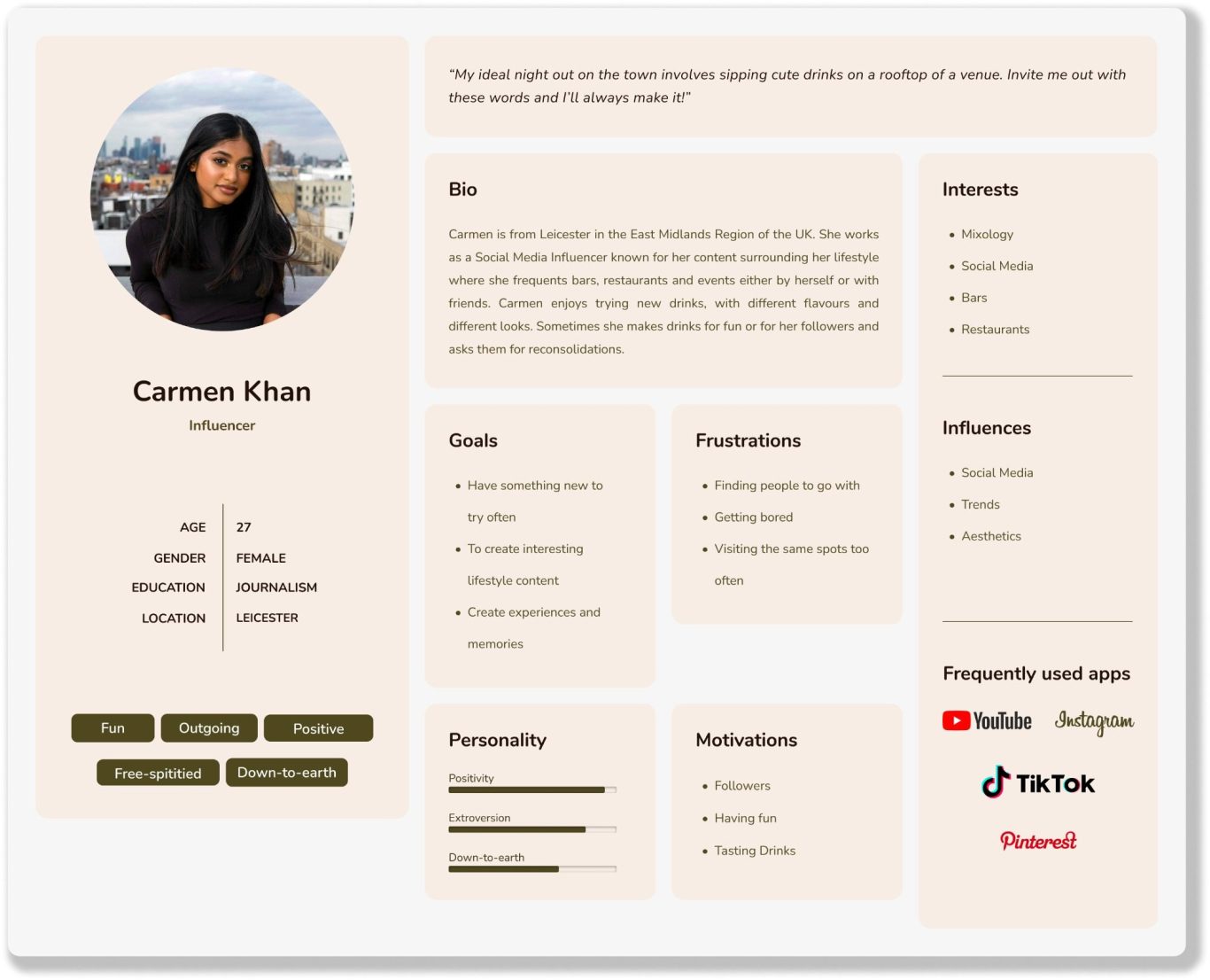
I adopted two user personas for this project, as I felt that The Likkur App couldn't be represented by just a single archetypal user. To showcase the different benefits and use cases that different types of people could have for the application based on prior research, I created Craig and Carmen. Read more about them below:
Initial Concepts and Ideas
To get started with this project, I immediately drove into pen and paper sketches of some initial ideas. I did some crazy 8 drawings of some screens that I thought could exist in the app, and wrote some ideas and annotations. This was followed by a moodboard to try and aid my visualisation and build a brand identity.
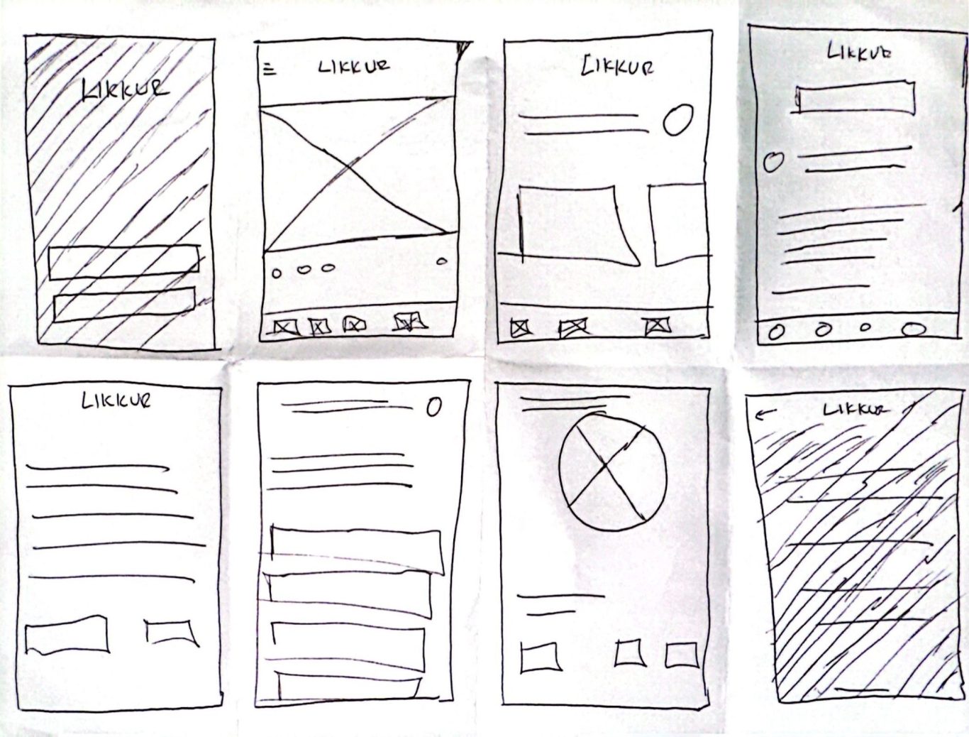
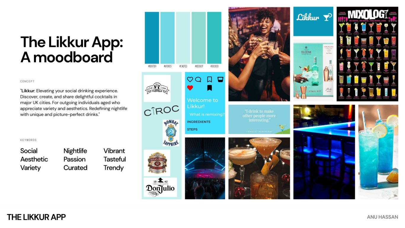
Using my crazy 8 sketches as a reference and my moodboard as inspiration, I had all the tools at my disposal to proceed onto the next stage which was to draw up some low-fidelity mockups in the Pencil app. The results are as seen below.
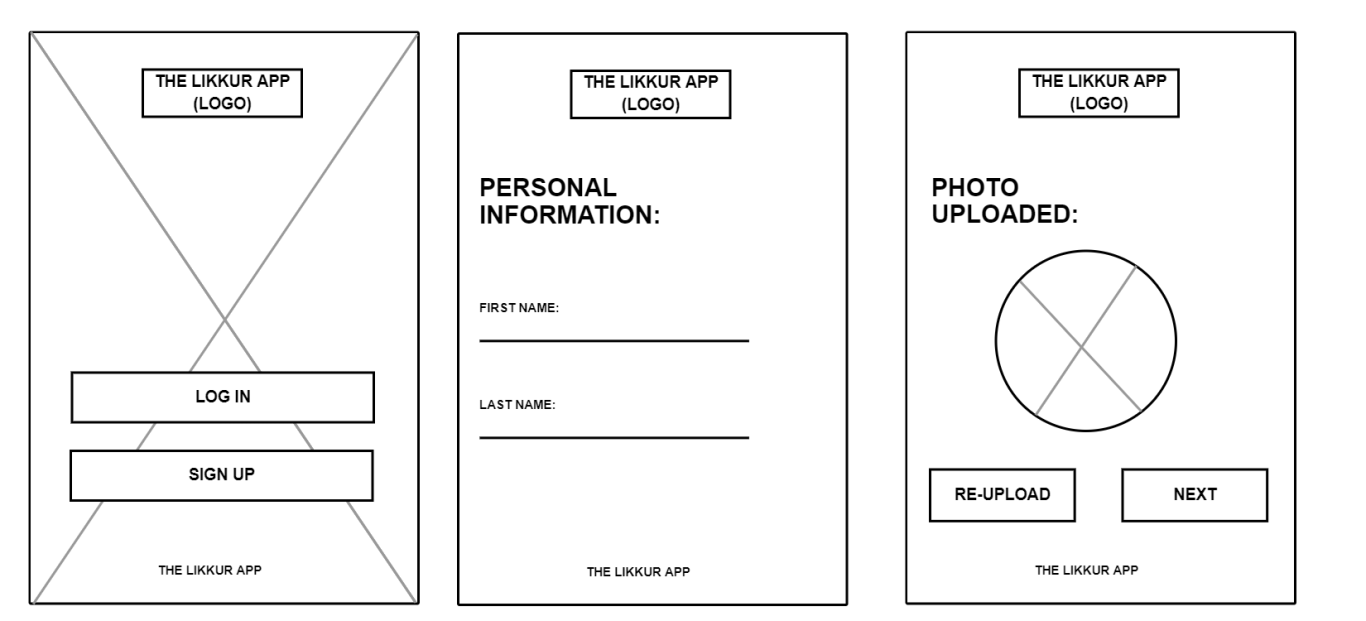
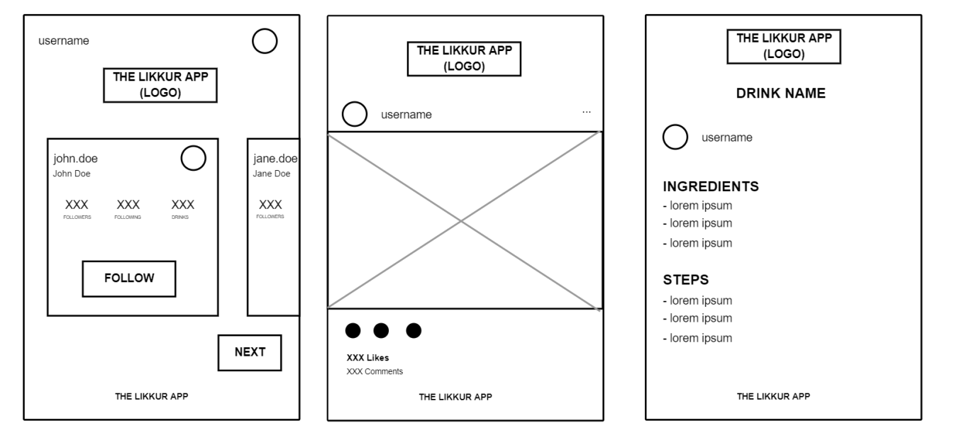
High-fi Mockups
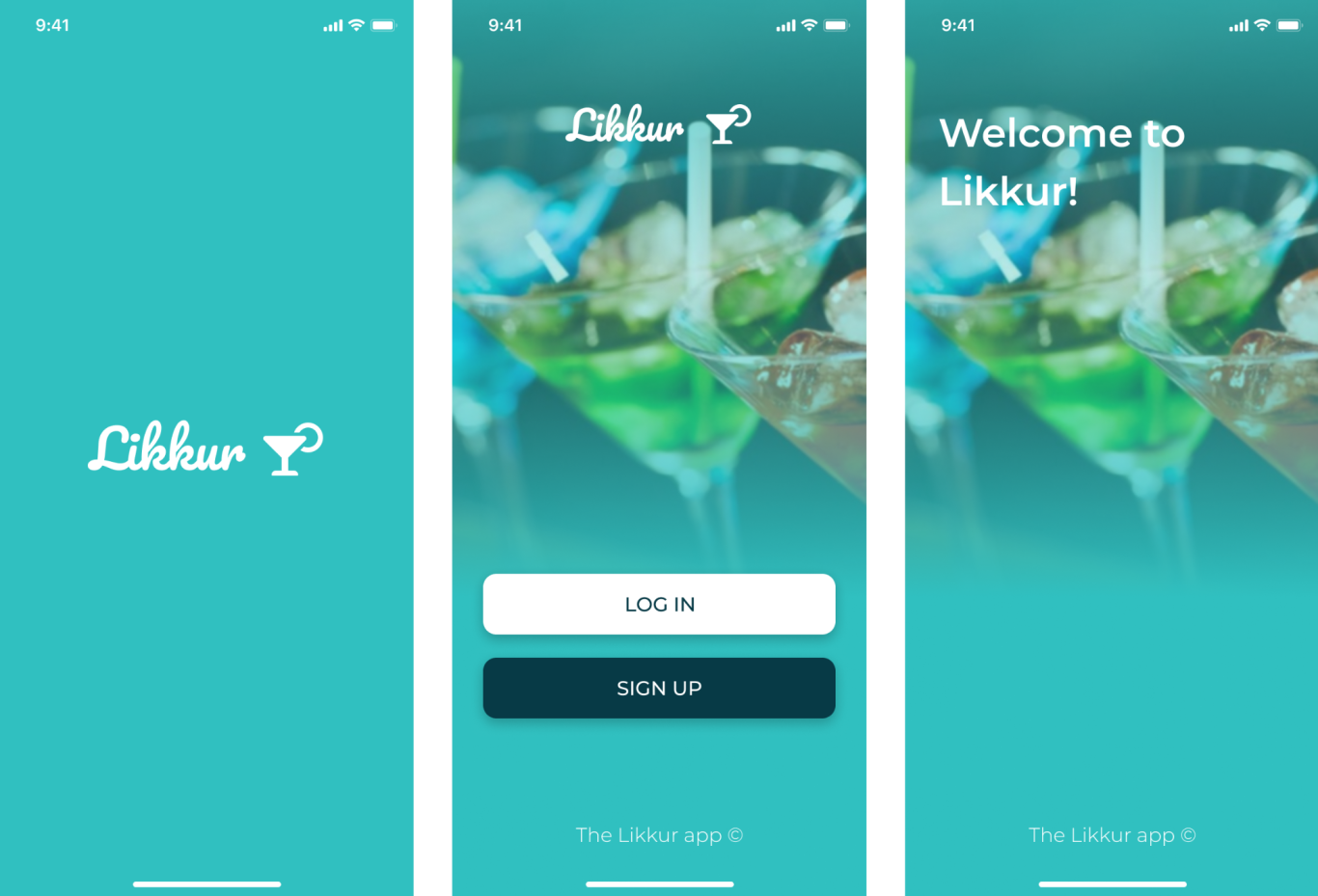
The next stage was to of course, was to turn my previously low-fidelity mockups into high-fi mockups, which I did using Figma. Here are some of the pictures:
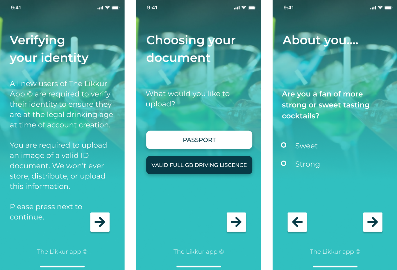
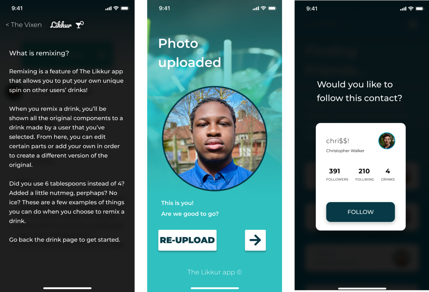
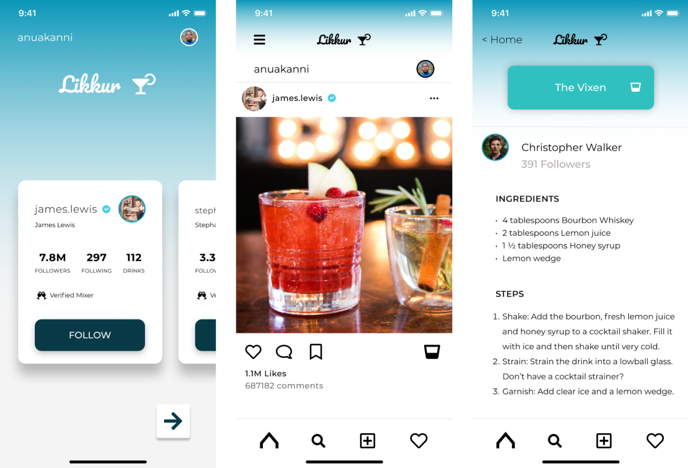
Usability Testing
For the usability test to take place, I had to prototype the high-fidelity mock-ups in Figma. Since we are working with high fidelity mock ups at this stage, the usability test was unmoderated, but still done in person so that I could make notes/observations, but I wouldn't guide or prompt them with a script. The test was conducted with a sample size of 5 testers. It required a iOS phone with the use of the Figma Preview App, and was conducted with the Problem Statement that we hope to gain insight from being:
"We want to assess the usability of our mobile app for our target users to be able to have a new worldwide interface medium to share and create cocktails for their tastes and preferences".
I had set a time frame of 15 minutes, with a target of 10 minutes. The test involved some think-aloud tasks, as well as a post-test rated questionnaire. The tasks that the users would undertake involved going through the onboarding process, finding and following friends, find out how to make a drink, and note taking.
I recorded the results of the usability test by writing the issues/findings received from the think-aloud tasks, questionnaire and my notes, sorting through them to prioritise and wrote up a summary of the issues and findings in the form of a Usability Test Report, which can be accessed here. Below, I discuss what suitable actions would be the best to take given the feedback.
Final thoughts
The results of the Likkur app usability test suggest a generally positive reception with promising aspects but also areas that warrant refinement. The following actions are recommended for the next steps:
- Enhance Onboarding Clarity: Make the onboarding more personal and more in-depth, keeping to the current style as it is user friendly and functional.
- Optimise Friend Connection Functionality: Make the connection process feel more “social” by using onboarding data and analytical data to help the user find out who to follow.
- Refine Content Discovery and Remixing Features: Fine-tune content discovery and remixing functionalities based on participant feedback. Enhance these features to ensure users can effortlessly explore and engage with content, fostering a more enjoyable experience.
- Address Occasional Prompting: Analyse instances where participants needed prompts and identify opportunities to refine the user journey. Aim for a more intuitive and guided experience, minimising the need for additional instructions during tasks.
By strategically addressing these action points, the Likkur app can undergo iterative improvements, aligning more closely with user expectations and ensuring a seamless, engaging experience for its target audience. Of course it is worth noting that this was indeed just a preliminary prototype and was in no way, shape or form intended to resemble a final product with all working features, so in reality the app would be a lot more content and exploration to cover. However the results of this usability test are more than enough to confirm assumptions and address weak areas of the app.
©DESIGNS BY ANU. ALL RIGHTS RESERVED
We need your consent to load the translations
We use a third-party service to translate the website content that may collect data about your activity. Please review the details and accept the service to view the translations.