Outfund™ Onboarding Redesign


The Problem
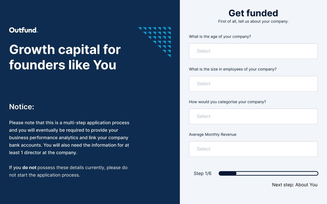
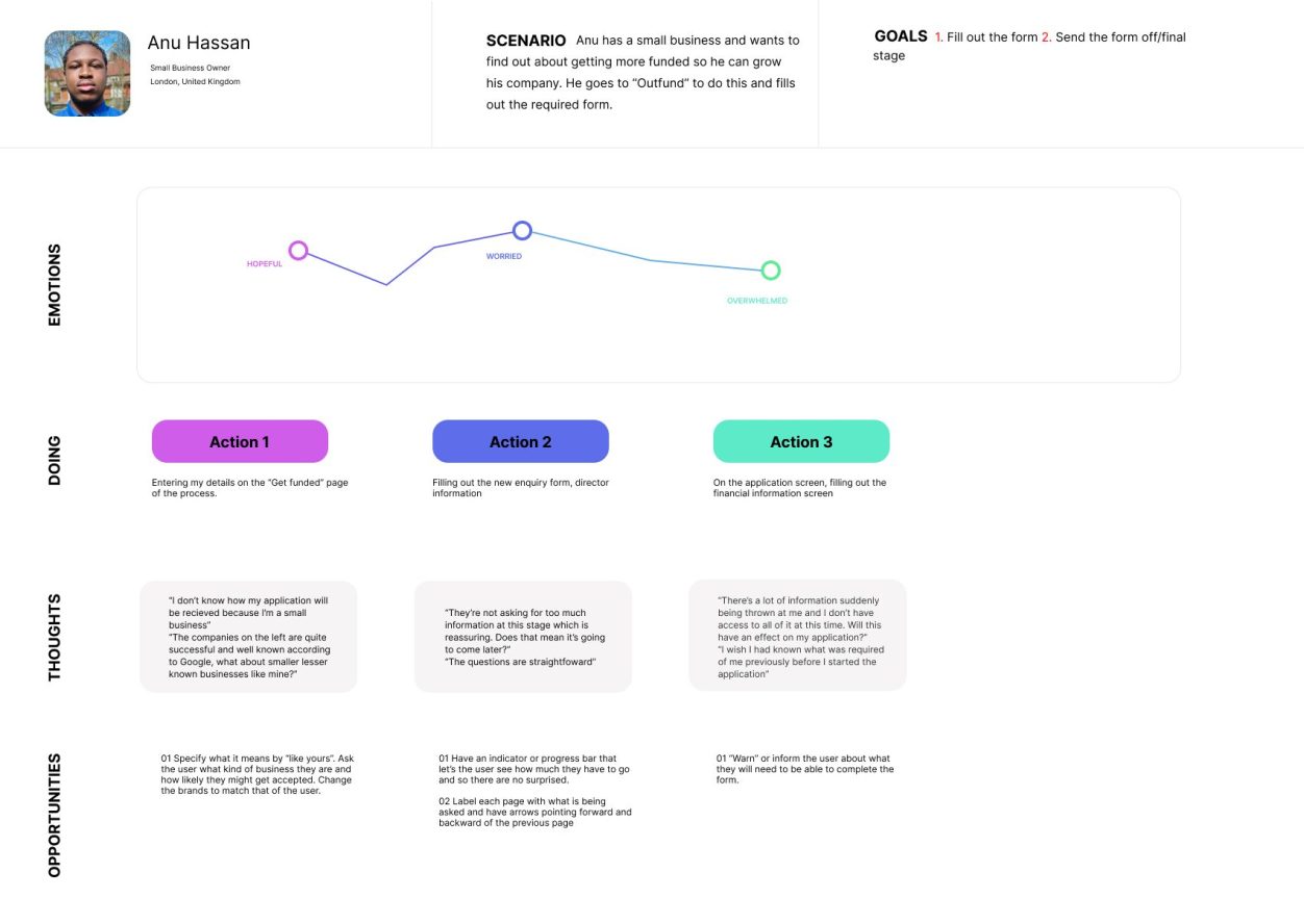
As outlined in the journey map, the “Get Funded” page is not designed as efficiently as it could be for small businesses. The example companies on the left of the page are quite successful, established businesses and the user may feel as though Outfund does not cater to or provide the same support to smaller businesses.
The tagline - “We've funded 1000's of brands like yours” is also very vague, i.e. what is “like yours”? That is quite subjective to the company applying. It needs to be more personalised.
The user also needs to be able to know exactly what they will need to successfully complete the process, since it seems simple at the start but quickly gets more complex and more demanding.
The Solution
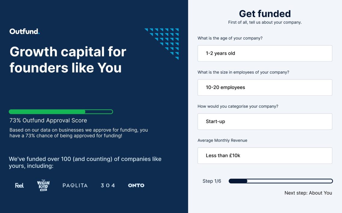
Ask the user what type of business they are, their age and other determining factors such as size of company etc. and have Outfund display a score that tells them a) how likley they are to be accepted for funding and b) how many businesses similar to them that they’ve worked with and some current examples.
In terms of the application, tell the user what they will need to complete the entire application, and not just the first page and make it clear that the first page is just one stage of the application process. Have a progress indicator bar with the amount of steps that you will need to take, with the “Get funded” page showing that it is the first stage and you have 5-6 screens left to go and eventually you will be required to connect your banking details and analytics.
Project Date: April 2022
Project Brief: I embarked on a captivating design challenge with Outfund. Initially interviewed for a designer position, I seized the opportunity to showcase my skills by tackling a redesign of a pivotal segment in the company's onboarding process. Armed with the insights gained from the interview process and my initial exploration of the existing site, I meticulously crafted a redesign that not only demonstrated my capabilities but also served as a testament to my commitment to elevating user interactions. Despite not securing the role, the experience was invaluable and became something I am proud to display as a valuable addition to my portfolio. This project remains as a symbol of my dedication and pursuit of excellent design.
©DESIGNS BY ANU. ALL RIGHTS RESERVED
We need your consent to load the translations
We use a third-party service to translate the website content that may collect data about your activity. Please review the details and accept the service to view the translations.
