BBFB (Breaking Barriers for BAME)

Project Overview
Problem: BBFB’s site was experiencing low user retention on their site and after some user testing they found that their current site was confusing for users as well as being difficult to navigate, especially for mobile users.
Goal: To visually design the BBFB website, revamp its body copy and develop it into a fully functioning website with Front-end programming.
Purpose: Increase readability to boost brand image and increase user retention.
Deliverables: Fully responsive website on the BBFB domain, implementing the designs.
Roles and Responsibilities
Lead UX Researcher & UI Designer, Copywriter, Front-end Developer. Responsible for uploading the website onto the server and fulfilling the needs of the BBFB team.
Initial user research summaries
BBFB was already established as a non-profit organisation at this point, so user research and an established clientele was already in place. Based on their analytics data collected from their website, the BBFB demographic is composed of young BAME individuals looking for careers in the civil service, those wanting to find out more about the organisation, or those considering it as a career path. Identified age groups are 17-25 and 26-32. Established people in the civil service also make up a part of the demographic, mostly based in London, and are looking for fresh talent.
User Personas & Journey Maps
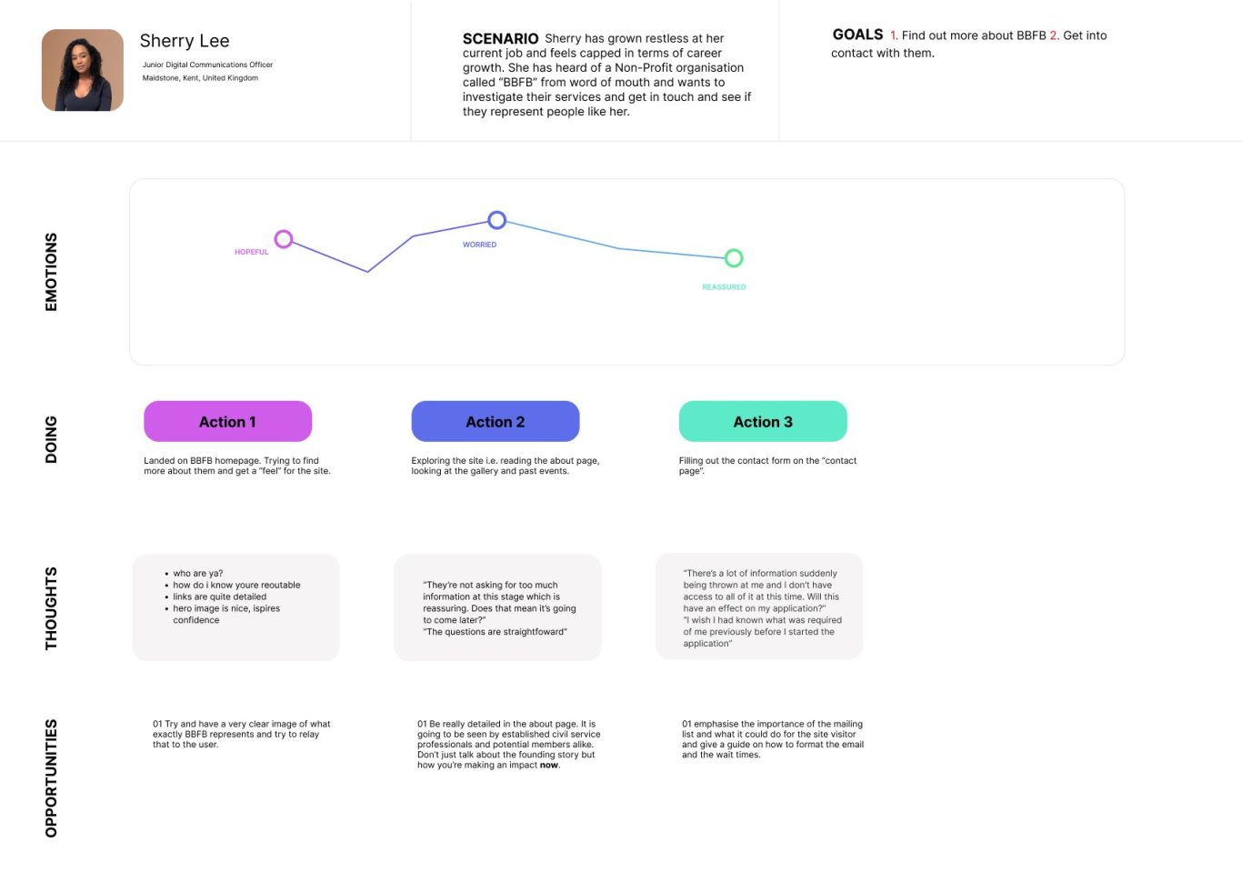
The principal user persona I decided to use for this redesign was Sherry Lee: A Digital Communications graduate who wants to break into the public sector and gain access to some important career-shaping knowledge. You can read more about Sherry on her persona card and view some of her thoughts and feelings on her empathy map below:

Initial Concepts and Ideas
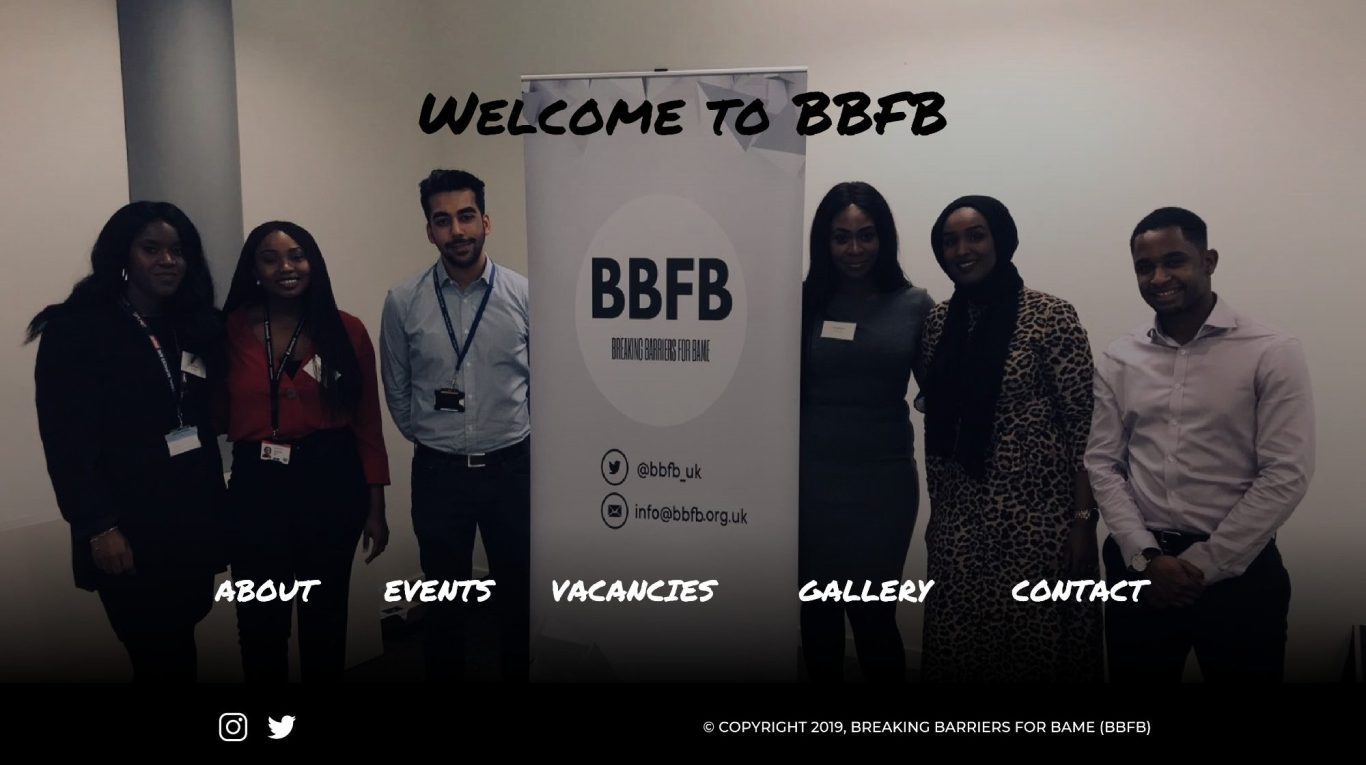
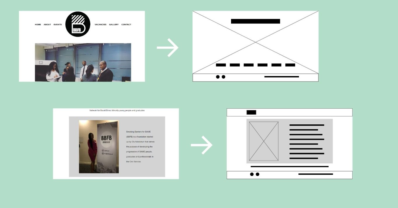
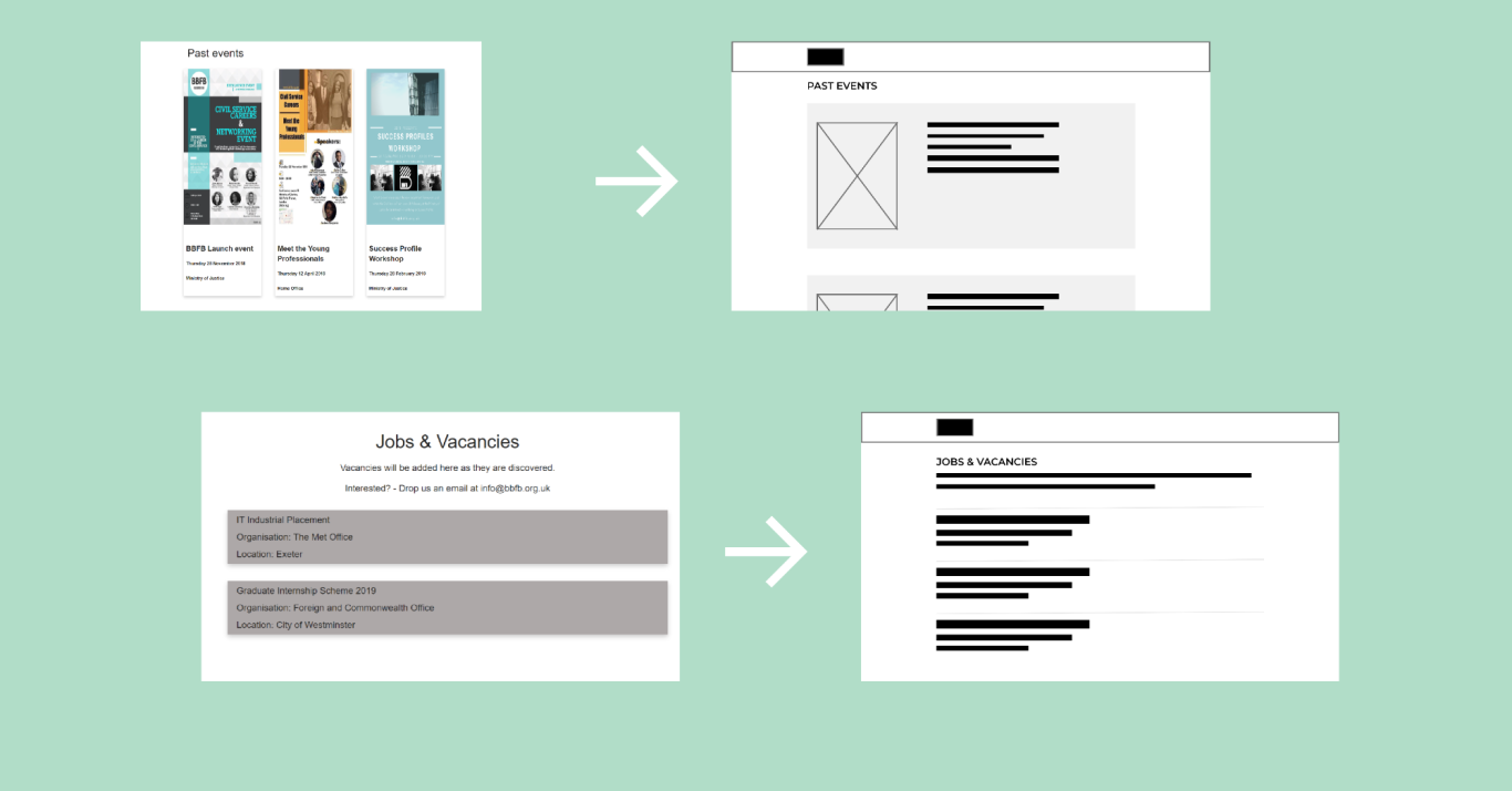
The original BBFB website used a one page layout to present all of their information. A full page screen grab of it can be found here. It was cluttered and unappealing, and had a poor sense of navigation and information hierarchy. I opted for separated pages, with each page having its own dedicated purpose and important information that it needs to relay. The home page will be designed to be warm and welcoming, having links to all parts of the site and a hero image of the team. Each subsequent page will be redesigned with the same simplistic principles as the old design, following the same patterns to keep the "feel" of the site the same, but will be overhauled on layout and presentation.
Below is a photo of a mind map populated with what people think of the BBFB brand. Similar adjectives/ideas were then sorted into grouped boxes, which will provided me with a tone of voice to keep in mind when redesigning. Following this are photos of the initial site and semi-corresponding redesigned medium-fidelity wireframes.



High-fi Mockups
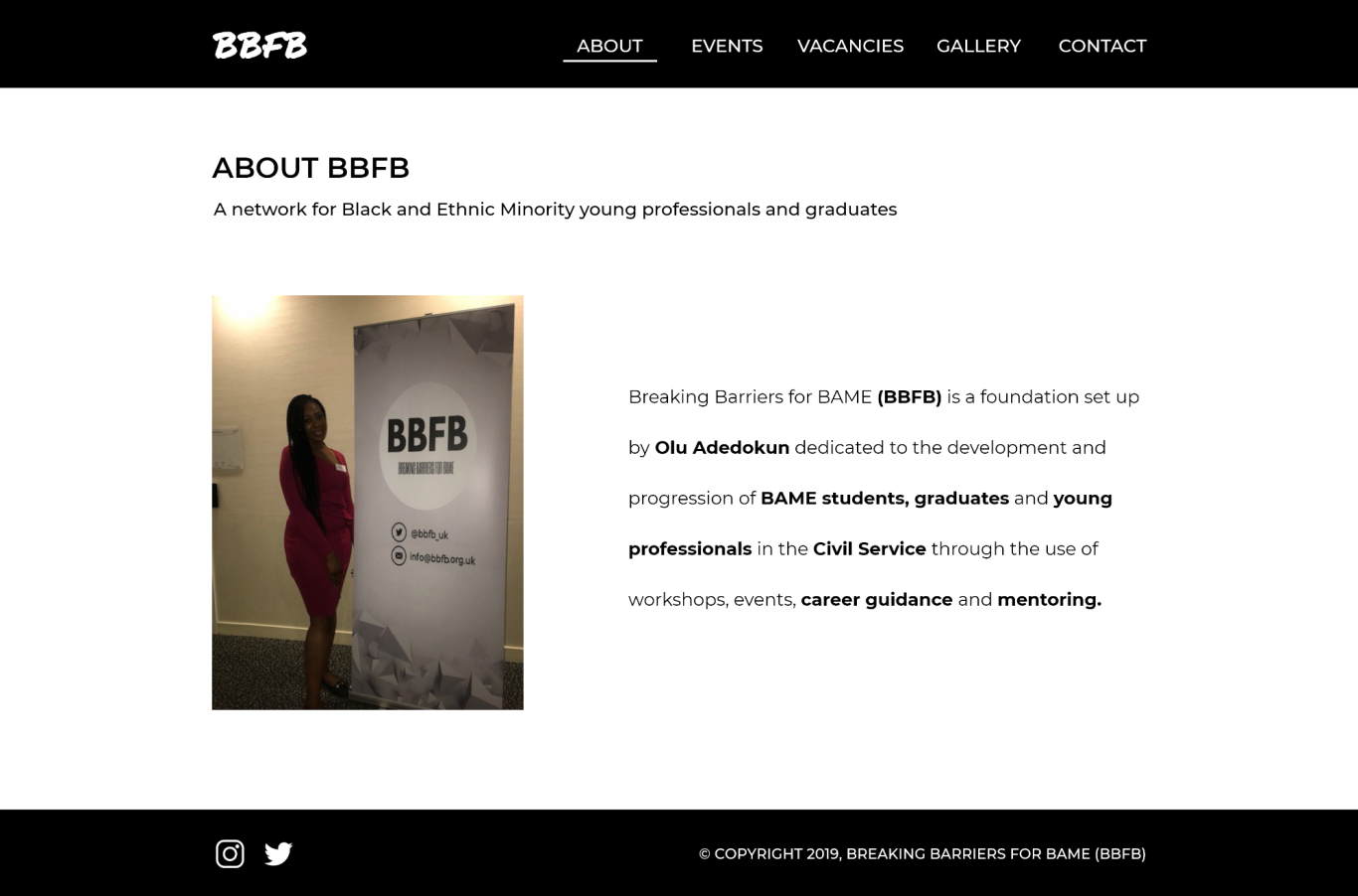
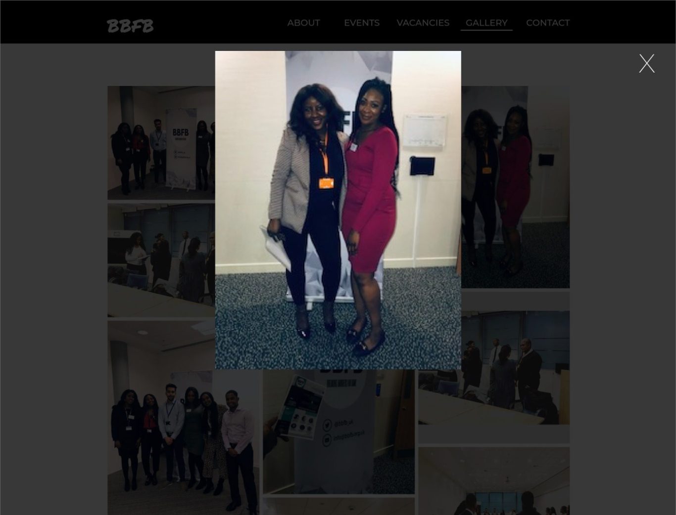
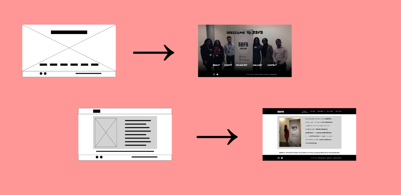
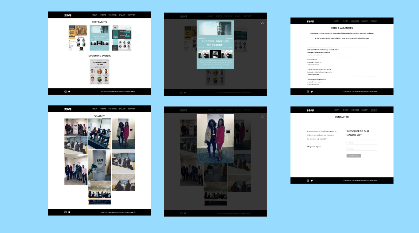
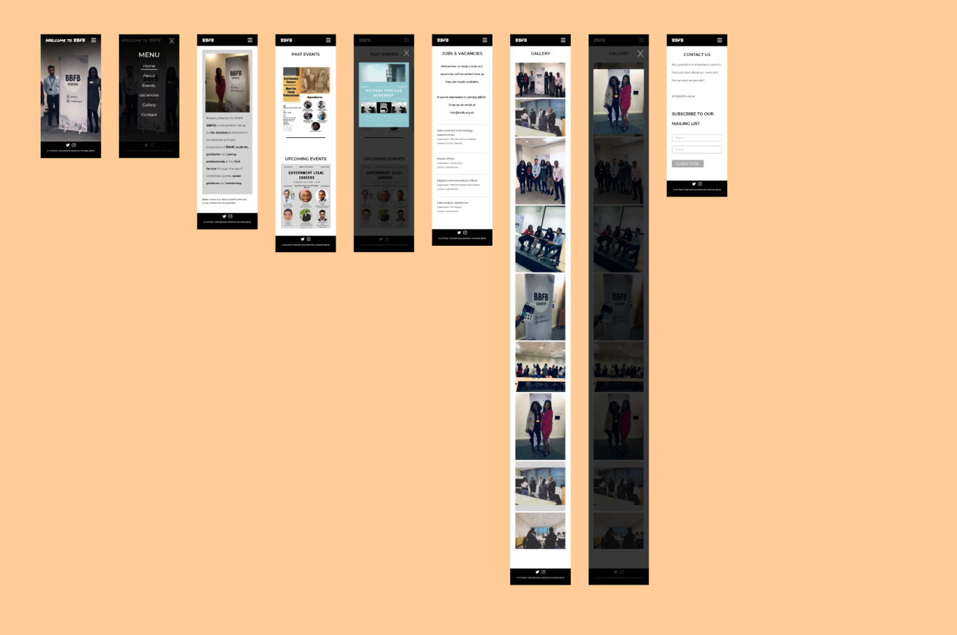
After showing these medium-fidelity mock-ups to the BBFB team, they were signed off and approved and I have the green light to go ahead and turn them into sleek higher fidelity mock-ups. I designed the mobile ones in addition to the desktop ones as I would be developing the fully responsive site after the design process was complete. Here are some images of the process after all the iterations were complete.
Usability Testing
For the usability test to take place, I had to prototype the high-fidelity mock-ups in Adobe XD. Since we are working with high fidelity mock ups at this stage, the usability test was unmoderated and done remotely, with a sample size of 7 testers. It required a laptop with the use of Adobe XD, and was conducted with the Problem Statement that we hope to gain insight from being:
"We want to improve the usability of our site for our target users to be able to navigate across the site easier than before, both on mobile and desktop devices, and improve their mental image of our brand."
I had set a time frame of 15 minutes, with a target of 10 minutes. The test involved some think-aloud tasks, as well as a post-test rated questionnaire. It would then be evaluated on criteria such as Time-On-Task, Task completion rate, user average session duration. The participants of the test were given free-roam control, meaning I allowed them to set their own tasks if they had any, or just wanted to view the new site, as the participants were just previous users and to do their tasks out loud. That way I could measure user retention and gain deep insights into their thoughts.
This data was all analysed and broken down and recorded into a usability test report, which was a comprehensive document detailing the goals, methodology, participants, and the findings, which can be accessed here.
Product Success
After the usability test proving the redesign was widely successful and I was green-lit by the BBFB team to start development, nut not before having one final meeting to discuss the constructive feedback that was garnered from the Usability Test Report. As this wasn't technically a redesign issue, it was a bit beyond my scope. Content copywriters worked with the team to produce additional content for new users, going more into detail about the brand, the team and the vision. After this, I began my development of the site with HTML, CSS, and jQuery. Once the site was live, there was a clear difference in site metrics from the ones prior. Most noticeably, there was a sharp increase in user retention rates, average session duration, more monthly visitors, more mobile visitors and more shares, which was all observed over a period of 6 months.
©DESIGNS BY ANU. ALL RIGHTS RESERVED
We need your consent to load the translations
We use a third-party service to translate the website content that may collect data about your activity. Please review the details and accept the service to view the translations.